The Frutiger Family: The Font That Inspired Fashion
By Writer's Room
By: Kasey Dugan...
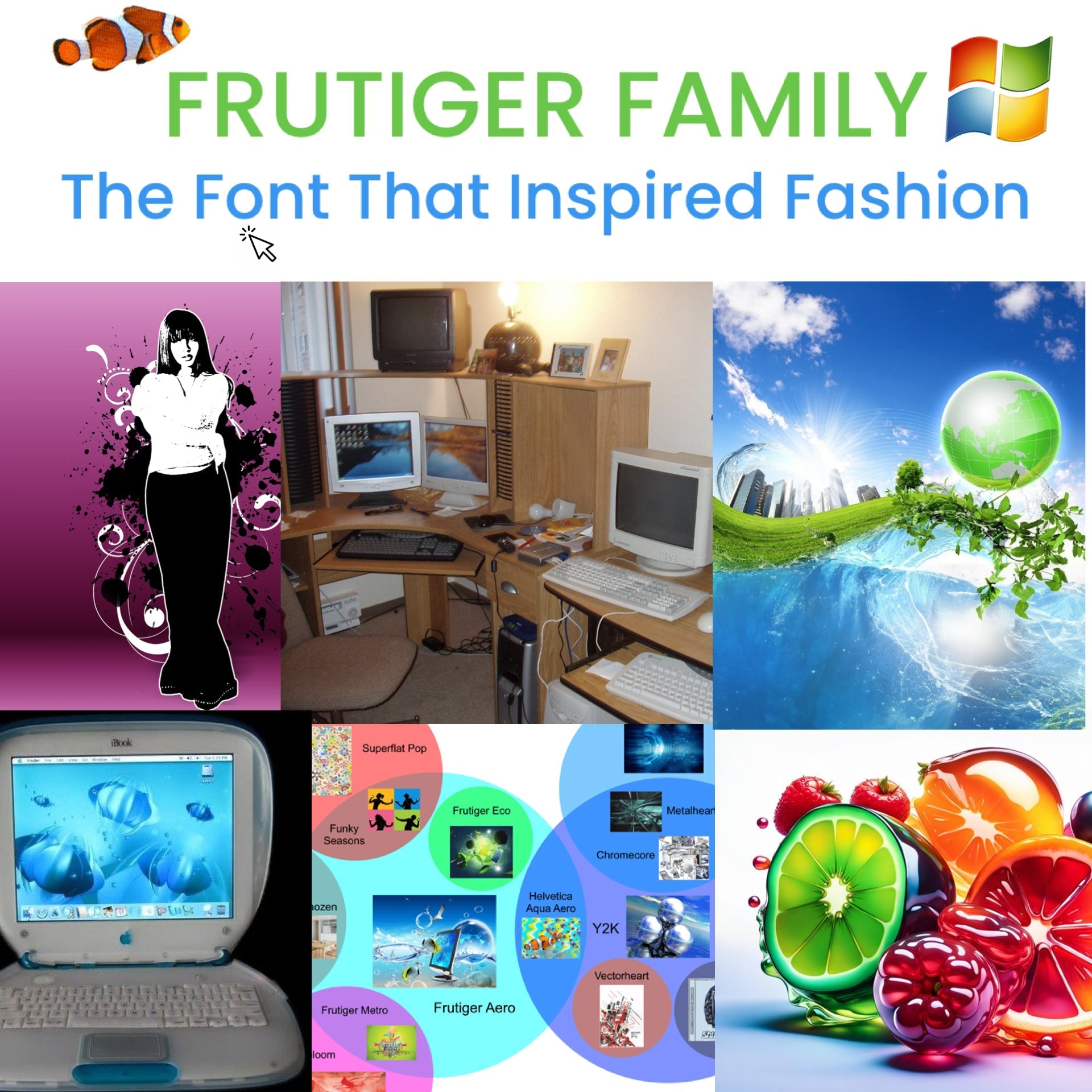
In the late 90s and early 2000s, people began designating spaces in their homes to display their computer systems. Larger houses may have had a computer room, or a room whose purpose was to accommodate the computer. Owners of smaller residences may have cleared out a corner of their living room to house their computer setup.
Image from Reddit
This wasn’t just a private practice; it was public, too. It became more and more common for libraries to install computer labs, clearing out rows of books or entire spaces to make way for the bulky technology. Internet cafes could be found in several cities and large towns (may I remind you that Snooki and JWoww wrote the notein an Internet Cafe). And U.S. public schools began to adopt Internet access as a means of accelerating education, incorporating the machinery into the daily routine of student schedules.
All of this is to say that computers — and the Internet — were suddenly a huge part of everyday culture. It fascinated us: we became connected through a shared language, technology, and experience.
And that’s how the Frutiger aesthetics came in.
The Frutiger aesthetics, or Frutiger Family, is an umbrella term used to describe several Y2K futurism aesthetics. These aesthetics are wide-ranging in many ways, but overlap in one central theme: computers.
The Frutiger aesthetics borrow unexpected elements from technology. Things like desktop screensavers and Microsoft applications would be repackaged and repurposed for a new, niche style unrelated to its electronics — like the ocean, for example.
But what is Frutiger? It’s a typeface, which is a design of numbers, letters, or symbols meant to be electronically displayed or printed. Frutiger is essentially a font style, named after its Swiss designer, Adrian Frutiger. As a typeface, it is considered to be one of the world’s most popular and legible sans-serif fonts, right along with Arial.
Frutiger Aero, Frutiger Metro, and Frutiger Eco are just some of the many aesthetics within the Frutiger Family. it's important to note that at the peak of their popularity, these aesthetics were not called “Frutiger ______.” This name was coined by aesthetic historian Sofi Lee (isn’t that such an amazing professional title?) of the Consumer Aesthetics Research Institutein 2017.
Some find the title to be disconnected or pretentious. I think it’s genius. It taps into the digital world of Microsoft, which undoubtedly merged with our physical world. And if you don’t think the digital world has anything to do with the fashion world by now, you might be as naive as Andy Sachs in her lumpy, blue sweater. It’s all connected.
But in order to effectively understand the Frutiger Family, and how a typeface could have such an impact on several, niche fashion trends, we should start on a much smaller scale.
So small … that it is considered the true nucleus of the Frutiger Family. I’m talking about Frutiger Aero (also coined by Sofi Lee), the aesthetic which inspired the Frutiger Family Tree.
Join me in my next blog to learn about Frutiger Aero, a forgotten-but-familiar aesthetic whether the ocean meets the Internet.
(And check back in, over the next few blogs, for the other Frutiger Family members.)


xqibif